free harvest gluten free co.
mock project: logo, branding & packaging
-
Free Harvest is a gluten free company that requires a logo, branding and packaging design.
- brief from @briefclub on instagram
-
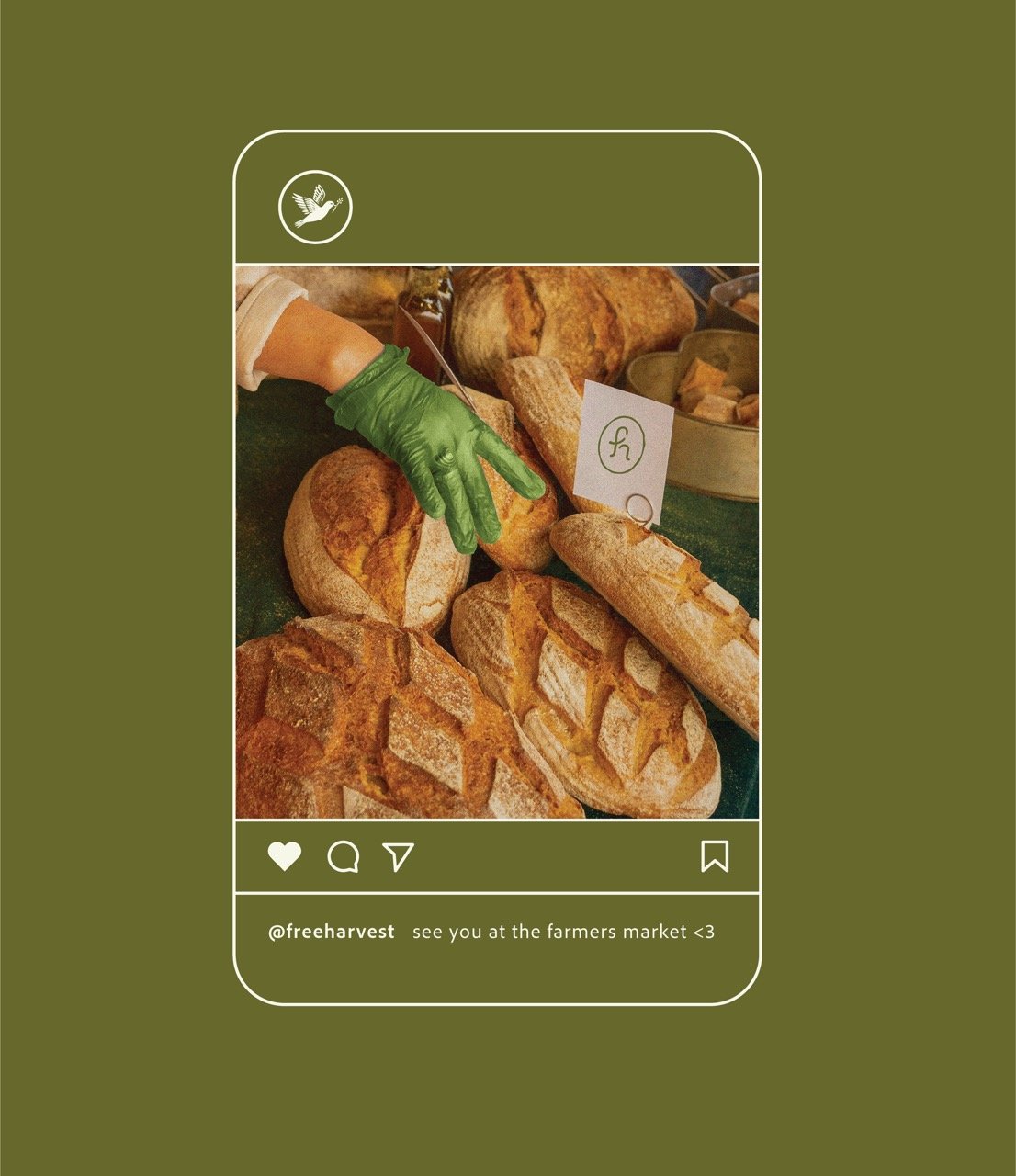
I imagine free harvest as a local bakery the has a shop and sells at local farmer's markets. They are natural and homemade.
A soft cursive font is used for the wordmark to evoke friendliness and a 'homemade' quality. The secondary font is slightly roughened to give it a natural feel.
The logomark was hand drawn and symbolizes harvest and freedom through the bird carrying the grain. The grain icon is used on packaging as well in pattern form and as abstract background marks.
Several logo formats were developed including a few stamps and the melding of the initials 'f' & 'h' into one form.
The color palette includes warm earth tones that call to mind growth, harvest, and fresh baked bread.
-
Adobe Illustrator
Procreate
Adobe Photoshop


