scoop’s creamery
logo, branding, menu, & packaging design
-
Revise a past project
I originally designed a sticker sheet for a fictional ice cream shop, and decided to revisit the project to develop branding and packaging for it.
-
Starting with my original sticker illustrations, I selected the stacked ice cream scoops as the jumping off point for the new branding. The stacked scoops were too vertical to remain as the logo, so I adjusted the illustration to be one scoop in a waffle cup to better fit in the logo lockup. The original cow illustration turned into a “stamp” and the scoop characters are woven throughout the branding and packaging. The original color palette of the stickers were also adjusted to be more vibrant.
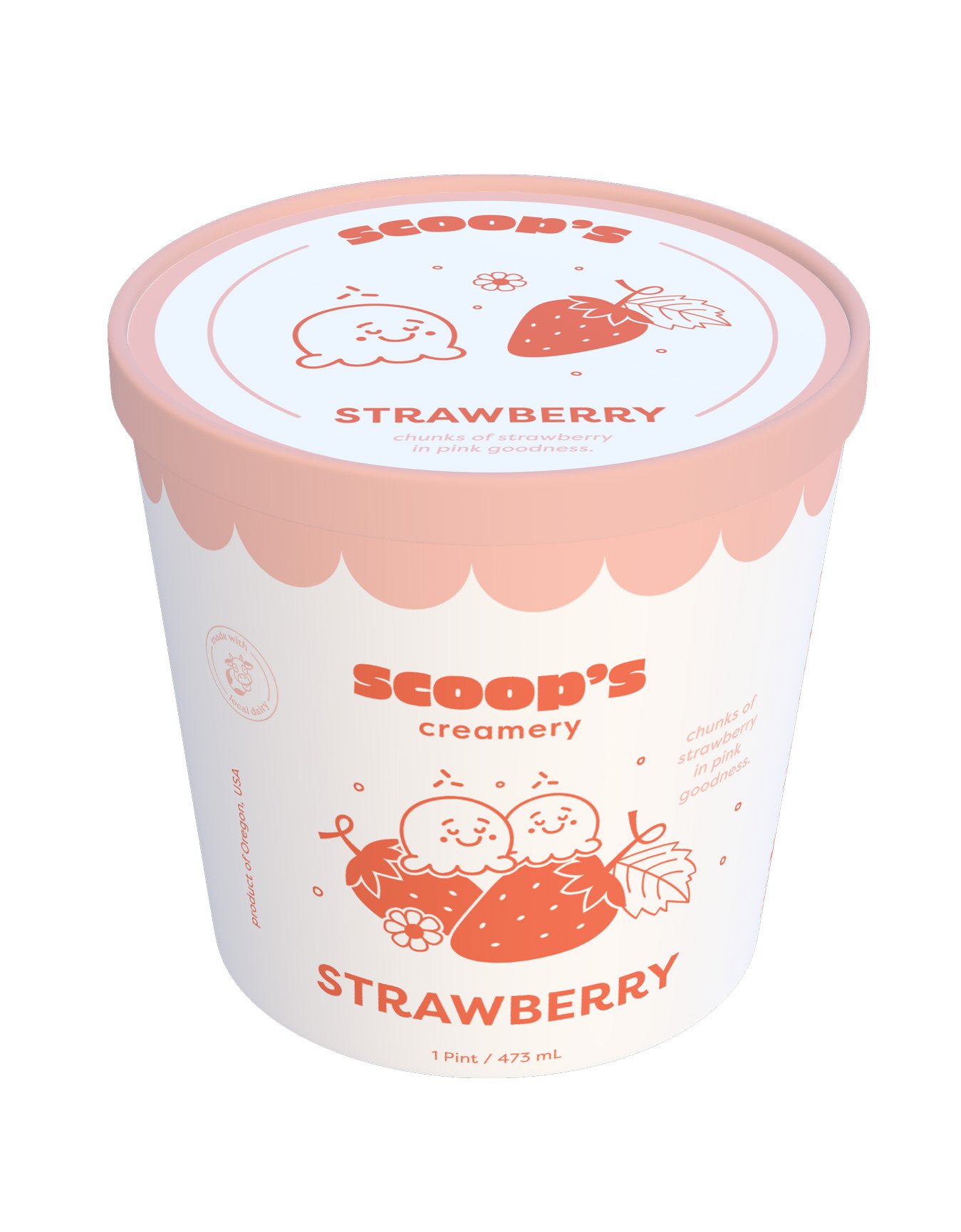
The packaging features a fun illustration of two ice cream scoops next to the ingredient – immediately capturing the attention of the consumer & communicating the flavor clearly.
The overall essence of friendliness, freshness, & quality are conveyed throughout the branding and packaging, resulting in a trustworthy brand/product to be shared among friends and family.
Developed a logo/branding
Created icons/graphics
Produced cohesive packaging for a series of 3 flavors
Designed a menu
Crafted mockups
-
Designer // Illustrator
-
Adobe Illustrator
Pacdora


original project:
Illustrate a set of five stickers for a local business
Stick to a color palette of 5 colors max


Revision:
Take elements from the original sticker designs & develop a logo & branding for an ice cream shop
Develop, packaging, graphics, and a menu to accompany the new brand


