
chum fruit bites
logo & packaging mock re-design
-
Chum Fruit Bites is all about providing a guilt-free, tasty snack experience. The brand celebrates the joy of indulgence in a healthier way, making it an essential treat for those who seek a balance between fun and mindful eating. Originally developed as a “candy alternative”, Chum Fruit Bites are a unique healthy snack that gives back to the environment by partnering with WildAid to protect endangered species.
Visual identity and packaging refresh to resonate with a younger audience and disrupt the traditional grocery aisle. The goal is to create a vibrant and modern look that not only stands out on the shelves but also communicates the brand's fun and flavorful personality.
Revitalize the Chum Fruit Bites logo to align with the new visual identity
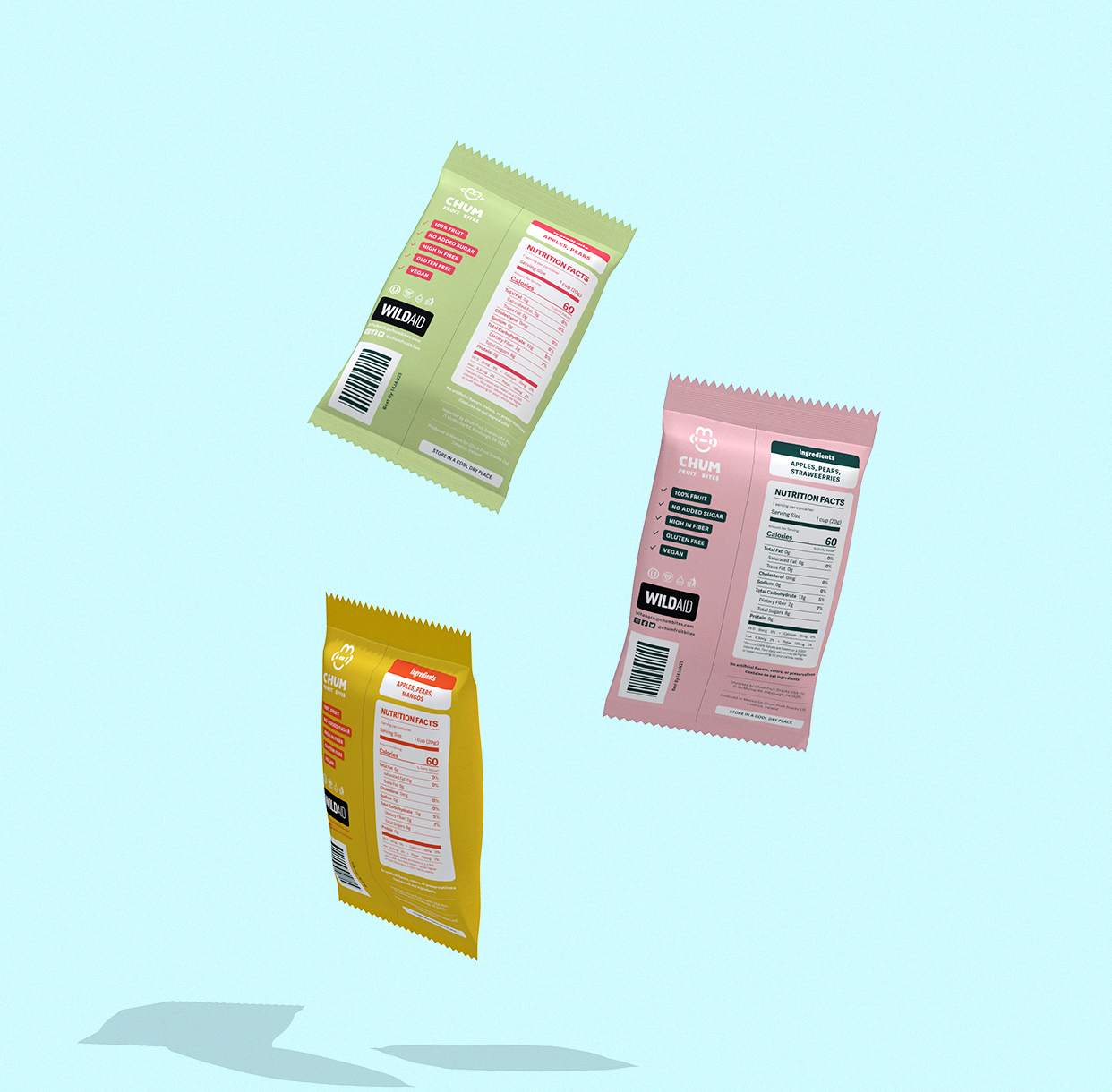
Develop a series of packaging concepts for different flavors that maintain a cohesive brand image while allowing for flavor-specific variations
Communicate ‘Irresistible Flavor Fusion, healthy indulgence, youthful energy, and disruptive innovation’
Stand out from competitors
-
Keeping the overall tone fun, approachable, and modern, I crafted a bold and vibrant color palette and utilized a paper-cut/hand-drawn geometric style for the illustrations. Three endangered animals were paired with three different fruit flavors for a playful interaction highlighting the flavor. Consistency is achieved throughout the series through illustrations style, color palette, and a triangle in the background of the illustration representing the shape of the snack.
The new logo mirrors the illustrations in their modern, playful, and authentic quality. The logo icon was discovered through breaking down and re-arranging the letters of the brand’s name. The result is an icon that reads as something resembling the face of an ambiguous animal. The letters of ‘Chum’ are subtle and more abstract allowing for a logo that is distinct and unique. The word-mark nicely contrasts the icon while matching the illustrations in it’s hand-drawn blocky rendering.
Gathered inspiration for 3 moodboards/concepts
Sketched and rendered illustrations for a series of 3 flavors
Developed logo & color palette
Crafted a series of 3 fruit snack packages
Maintained brand voice/tone consistency while allowing for variation
Stuck to a timeline & presented to a *Creative Director
* My AIGA mentor who acted as the “client” and oversaw the project and offered feedback
-
Designer // Illustrator
Credit:
Creative Direction - Bailey Bray -
Procreate
Adobe Illustrator
Pacdora


Vibrant
*
Modern
*
Flavorful
*
Playful
*
Authentic
*
Healthy
*
Vibrant * Modern * Flavorful * Playful * Authentic * Healthy *
BEFORE…

The original packaging design is bold and connotes strength, but it feels more like a protein bar than a healthy fruit snack due to the fierce/scary eyes and exclusion of fruit imagery.
The original logo is simple and it does the job, but it’s lacking a bit of personality.
The speech bubble suggests that the animals are talking, but other than that, it doesn’t say much about the brand. With the name ‘Chum’ there is potential for a more memorable and intriguing logo.

AFTER…


The updated packaging better reflects the brand’s playful and organic tone with illustrations that retain some of the geometric qualities of the prior label but in a papercut & hand-drawn style. There is a subtle triangle in the background of each illustration to tie back to the shape of the fruit snack and maintain consistency while allowing for flavor-specific variations.
The new logo mirrors the illustrations in their modern, playful, and authentic quality. The logo icon was discovered through breaking down and re-arranging the letters of the brand’s name. The result is an icon that reads as something resembling the face of an ambiguous animal.
The letters of ‘Chum’ are subtle and more abstract allowing for a logo that is distinct and unique. The word-mark nicely contrasts the icon while matching the illustrations in it’s hand-drawn blocky rendering.
